
Role and Responsibilities: User Experience Consultant
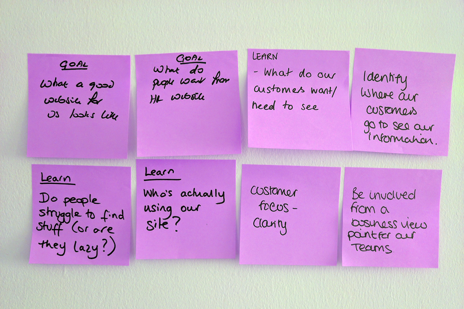
The team had goals to reduce the amount of time spent responding to frequently asked questions and general employment information so they could invest in complex support cases and find space to review processes and make improvements to the service.
Staff content at the university is public as part of their drive towards employment transparency. All policies, procedures and information for employees is available to the world.
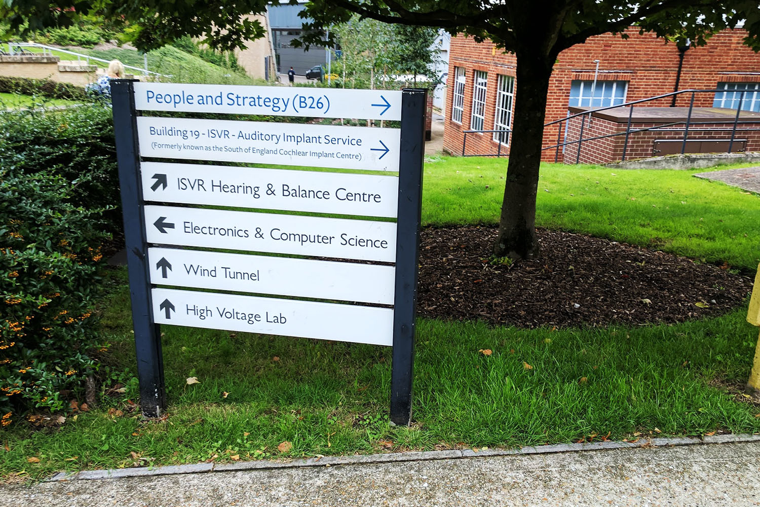
But with every department having its own sub-sections on the site, it is easy to get lost when using the on-site search because it returns results for students, like degree course information in the same space as booking time off for staff, or current job vacancies.
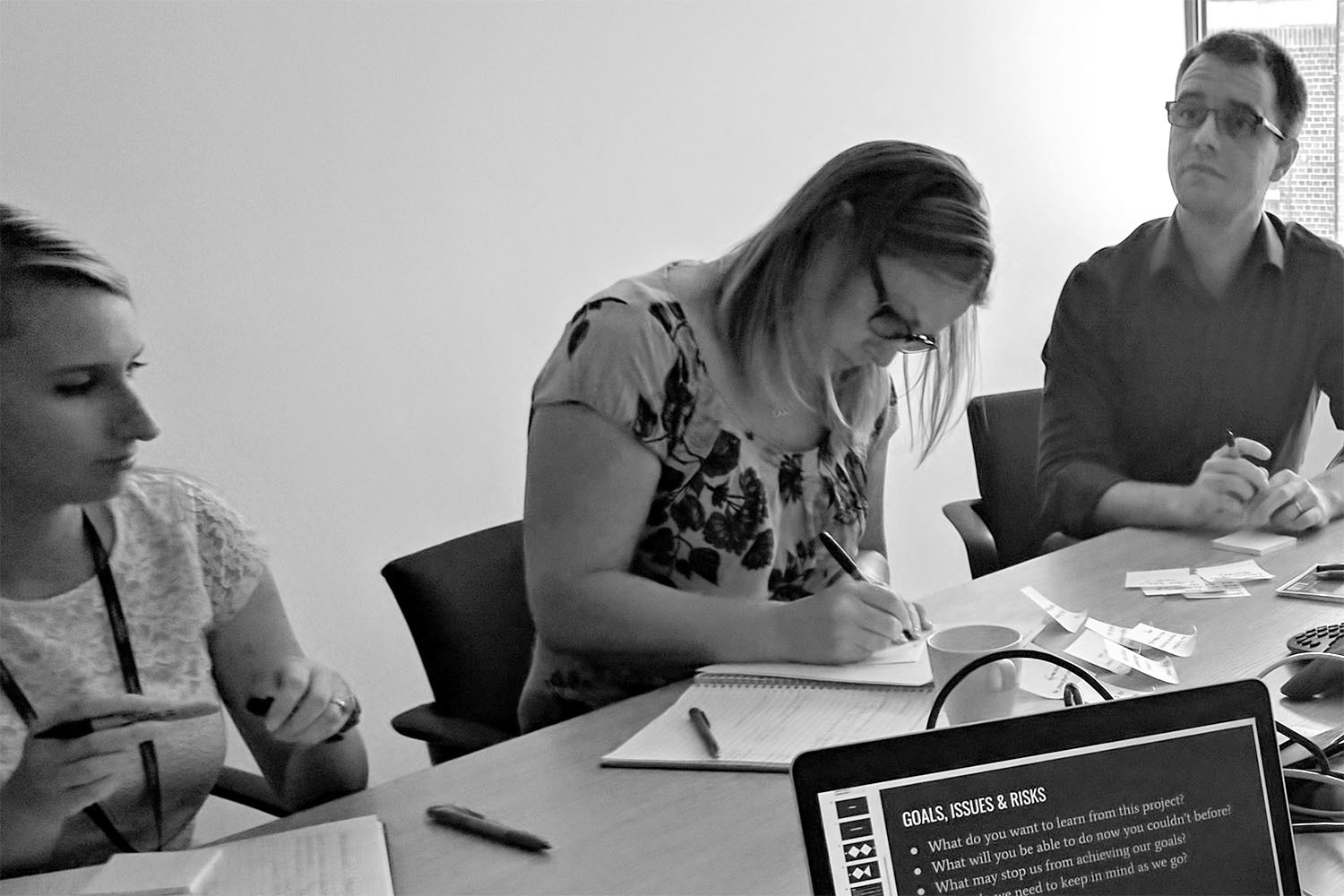
We met with a cross section of staff from across the university functions including teaching and research faculties, professional services such as IT, finance, catering, facilities and a group session with all representatives from the unions that operate within the university.
The content on the site wasn’t giving people what they wanted, but neither were the policy documents that were attached.
Anyone can download a form, it’s knowing what to do with it that is unknown – Line Manager in Faculty Staff
Managers wanted guidance on how to handle tasks, usually the ones they don’t have to do often like appraisals, disciplinary procedures or handling specific needs from their team members.
The site content consisted of pages which would explain the definition of a policy, or how a specific aspect was described in the policy. What they drastically lacked was any guidance on what to do with the information or how to know whether you are doing something in the way it was intended.
The current content had been split into areas for managers and staff. This made little sense because managers are also staff.
What we were seeing is that people wanted to understand a specific process from two sides.
Taking appraisals as an example, managers and team leads wanted to know how to run appraisal sessions with their team members and ensure that they were following the guidelines.
Non-managerial staff wanted to know how to prepare for their appraisal, what they needed to complete beforehand and how the process works.
When we looked at new starters, we realised this term didn’t just include members who were new to the university, but included people who may have been promoted into lead, or manager positions who had no experience and needed support to understand and learn about their new responsibilities.
Both groups showed that the issue wasn’t whether they could find a policy, but that they didn’t need it. They needed guidance on how to be managers and team leaders.
This is what was causing the high enquiry rates.
We have to support the line managers, because for the few that can, there are many that can’t. – Administration Support Staff Member
A content audit was carried out revealing there were over 400 links on the A-Z page that lead to 368 pages that described in part or whole a policy. All of these pages linked to the same policy documents either in PDF or locked Microsoft Word documents. There are less than 100 policy documents.
After reviewing our discovery outputs the HR team decided drastic measures were in order. They wanted to rewrite all the page content to be reflective of the need we had uncovered and radically change the way content was grouped to match how people wanted to find it - not how the policy described it. This would coincide with a pre-planned policy review programme which would be updating policies and reviewing them for plain English writing.
Based on reviewing web analytics over a 6 month period year on year we concluded that content around annual leave and sickness gained the highest traffic. We chose this to be the area we would focus on to create an exemplar for all future content.
We ran a series of content design workshops with the HR team to review the way information was described and what people were looking for.
For example, it wasn’t going to be helpful to have a page called Dignity at Work, if everyone who would benefit from finding the content on the page was looking for reporting discrimination at work.
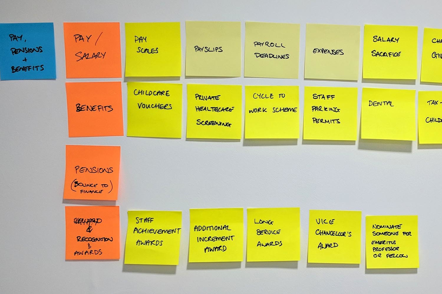
In a full day session we were able to remap the entire content needs, including killing off redundant content and merging topics where it would make it easier to find.
Our resulting labels were further refined, and plotted into a content planner which included a description column where the team wrote what you should expect to find on that page, or in that section.
We are big advocates for creating prototypes for services to help those of us who are visual thinkers. Traditional information architecture diagrams, site maps, or spreadsheets are fine for documenting things, but we believe that making something quick and simple to demonstrate how something might work is the greatest way to share an idea.
So that’s just what we did.

Using existing page templates we created a simple html prototype that would allow us to test our navigation with service users and demonstrate to the wider stakeholder groups what our vision for the future was.
Optimal Workshop have a wide selection of quick to setup information architecture test systems including Treejack for validating page labels. We conducted a test that was made available to the entire university with a fantastic participation rate of over 300.

The results were mostly positive and provided us with a clear direction for revising the location of a number of key items before committing to the design of pages and the writing of content. This simple test took us only a day to put together and ran over the course of one week.
By conducting these quick tests we saved the team potentially £1,000s in producing new content and structures only to find they don’t work and having to do it all over again.
Over the next 12 months the team will be revising all the sections of the site, launching topic areas based on traffic volume which are monitored for 3 months for feedback and review.
This has brought around a positive change to the ways of working for the team. Now able to act more agile, they are able to set KPIs before producing content and then launching it.
With a new feedback system in-page, they’re able to gather insight into whether what is being produced is meeting the needs of their customers faster.
Ultimately, this new approach, although seemingly drastic in nature is both streamlined, and accurate to the needs of the customer the service is designed for.