Role and Responsibilities: Senior UX Architect
The Child Maintenance Enforcement Commission (CMEC) provide information and support to parents in relation to the welfare, support and financial responsibility of raising a child after separation. The group works with public organisations as well as other governmental departments on providing this public service.
For the duration of the project I lead discovery, and facilitated workshops with members of the public and senior cabinet ministers.
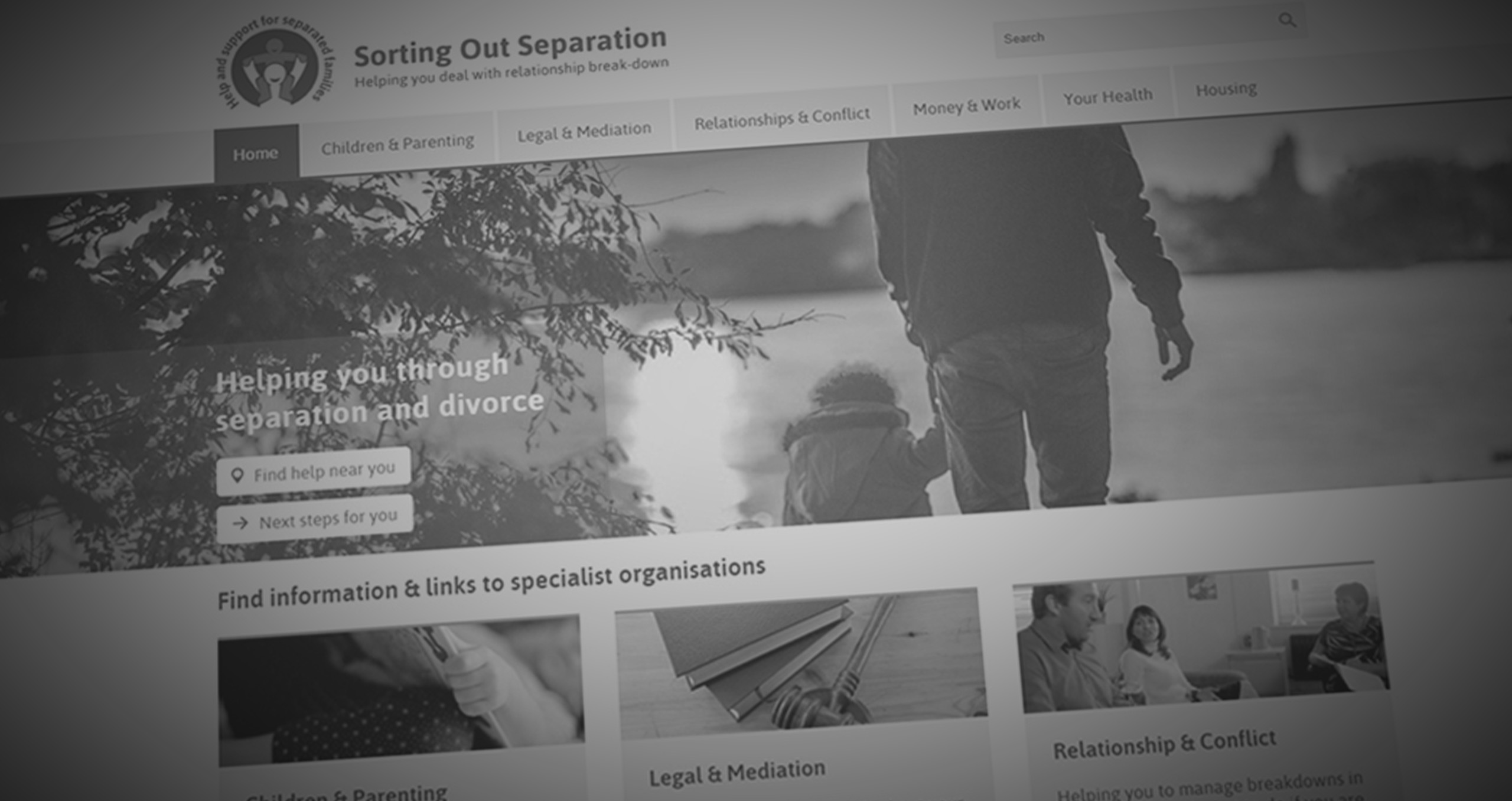
There is a wealth of information available online for parents seeking support and information through both government and private sector sites, however this is no single location for parents to go to that will help them find everything they may need within the UK Government.
CMEC (The Child Maintenance Enforcement Commission) wanted to create a web app that would provide signposting to the available resources, and that could be added to any website and be owned by anyone.
This was to ensure that this valuable tool would not be lost in the array of government sites and services. Instead they wanted to be able to have the app embedded into public forums and sites such as Netmums, bringing the app to its audience where they’re most likely to be seeking advice.

Interviews were conducted with members of the steering group; representing a number of public charities, government bodies and experts in the subject matter such Relate, Netmums, Dad.info, mumsnet.
I found conflicting opinions which were based on the commercial drivers of the private sector and policy within the government sector around what the app should do and what the focus should be. This appeared to be a common issue when these different groups tried working together - in spite of wanting the same positive and in some cases life changing outcomes.
I wanted to keep reminding them of their primary focal point - the children.
During the project playback of all the results I highlighted the key points where there were major conflicts - all anonymised in order for us collectively to discuss how we create a single vision.
The issues of how people find content was also a major point to the project. Once people had discovered the app, how would they find what they were looking for, or if they didn’t know what help they needed how would they find out?
We received a list of themes and sub-themes which are covered by CMEC services and discovered that the terminology used was on the whole very government influenced; lots of abbreviations, acronyms and legalese.
Using Optimal Sort, I conducted a public open sort to see how people would group the content and to validate my request to revise some of the descriptions. This was carried out by 30 people and the results compiled into a report and returned to the client for review.
With major revisions to the client proposed architecture, I created new site maps and user journeys.
Wanting to create an app that would be well received by its audience and understand their current emotional state was going to determine its success.
The DWP working group wanted a diagnosis tool that would cover the core themes and provide signposting to relevant resources based on the answers provided.
I was concerned this concept was that it could be considered cold, asking a series of questions they had probably been asked countless times before giving them a long list of referring links for yet more things to read.
My solution was to ensure that the questions were to be written in a friendly tone and that the final outcome provided more than a link list. I worked with members of the DWP group and a copywriter to develop a matrix of content pieces that would create the support plan and information that would be returned upon completing the wizard. The same content could then be searched for as a query - “I am a grandmother what can I do?” - and browsed from within the app using the navigation menu.
This created three alternative methods for finding content.

I spent an afternoon with the DWP team running a workshop that created wireframe interfaces of how we all saw the app working, along with storyboards of how it might be used. We prioritised and agreed a direction that we felt was best for the app.
In order to test out our theory, I created an interactive prototype in Axure RP, using one of the journeys we had formalised during the workshop.
This works using one of the user journeys defined and incorporates the questionnaire logic which we created with the client. The prototype also included the browse, search and sharing/embedding options for the web app. The prototype was presented back to the client for user acceptance testing before the project was passed on to a development team.
The total development of the web app took several months and coincided with my departure from Lightmaker. The resulting app was promoted extensively by the DWP and received mixed opinion publicly.